Monthly Archives: October 2014

EDGAR – Assessing Available Data

Accessing the EDGAR FTP, I was able to download all SEC filings for CQ3 2014 which includes about 206,000 lines of data. It should not be a problem to scale the dataset to include previous years. For now, I focused on CQ3 2014, from a high level.

EDGAR classifies each company by CIK code. By accessing Rank and Filed, I was able to download an index of CIK codes that map to US Exchange Tickers. I integrated this index with my dataset, and now am able to identify companies on a more universal basis (tickers).

I logged the frequency of each form filing, and chose to isolate Form 3, Form 4, and 13-D.

Figure 3.1.2.1: Frequency of Form 3 Filings, CQ3 2014

Picture2_sec

Figure 3.1.2.2: Frequency of Form 4 Filings, CQ3 2014

Picture1_sec

Figure 3.1.2.3: Frequency of Form 13D/A Filings, CQ3 2014

Picture3_sec

I ran a quick regression between frequency of form filings (4, 3, SC 13D/A, 4/A, SC 13G/A, DEFA 14A, SC 13G, SC 13D) and the SP500 to see if there were any general relationships between frequency of filing and broad index performance.

Figure 3.1.2.4: SP500, 7/1/14 – 9/30/14

Picture4_sec

Figure 3.1.2.5: Regression Analysis, SP500 v. Form Filing Frequency

Picture5_sec

On a broad scale, the correlation is null. Delving in to more micro analysis, I sought to determine 10 companies I’d test my analysis upon. I incorporated each Company’s market capitalization from FactSet to screen for inactive companies and cleanse my dataset. I reduced my data set in the following order:

  • Began with 13,063 unique tickers
  • Excluded Companies with 0 market cap; remaining = 7,427 companies
  • Counted number of companies with market capitalization between $500MM and $2,000MM

I then sought to define what consituted an “active” filer. I parsed out the average and median filing frequencies for companies at different intervals.

Figure 3.1.2.6: Frequency of Filings at Different Market Capitalizations

Picture6_sec

I began to hone in on my target Company profile: somewhere between the range of $500MM and $5,000MM. I also took a sample of the aggregate sample size, measuring the first and third quartiles of filings for Companies with market cap > $500MM excluding companies that haven’t filed (active Companies are required to file very quarter).

Figure 3.1.2.7: First and Third Quartile: Number of Filings with SEC for Companies with > $500MM Market Cap

Picture7_sec

At this point in time, I defined a frequent filer as one that posted more than 23 filings per quarter. I justified this because my sample population of companies has a median of less than 13 filings per quarter, and only almost hitting 20 when including skewed averages.

The following companies are the companies I have chosen to analyze

Figure 3.1.2.8: EDGAR Project Universe v1

Picture8_sec

Follow-Up

  • Develop scalable time series model to observe price reaction relative to Form 3 + 4 filings.
    • Graphical representation for 3Q 2014 (linear) & date of form filing (point)
      • Record top/bottom 3 dates for price reaction
      • Count if form filing occurs within 3-4 days of resultant reaction, simple percentage basis.
      • End goal is to parse occurence within +/- 1, 2, 3, 4 days of filing over universe of 50 companies and record results.
      • If a relationship is established, structure data in terms of 1) classifications between gains / loss; 2) magnitude of gains/ loss per period observed for relevant period 3) normalize for corresponding SP500 gains/loss to eliminate market counfound
  • Count only unique occurences of filings and record titles of sellers (buyers)

EDGAR – Execution Plan

FTP Syntax
ftp://ftp.sec.gov/edgar/daily-index/form.20141015.idx

Plan

  1. Batch download daily information from SEC EDGAR for period October 1st, 2014 > October 25, 2014
  2. Count occurrences > Form 3, Form 4, Form 13D
  3. Record 1D, 2D, 7D, 14D price reaction
  4. Regress filing occurence vs. price reaction (standard 1,2,3,4 quartiles)

Considerations

  • Derive company ticker from SEC CIK code
  • Batch download price data from Yahoo finance (defer to FactSet if process is too time consuming)

Crunchbase – UI Update

Crunchbase Project

Following the initial analysis, I assembled three forms. After defining the following parameters:

  1. Industry
  2. Region

My form auto-popluates with relevant information related to a company’s geography, total funding, and website. Further detail:

  • Form One: Companies by region > median funding > average funding
  • Form Two: Funding League Table, Top 20 Companies in terms of total funding
  • Form Three: Auto-populate list of all companies in dataset including
    • Company Name
    • Company Website
    • Total Funding
    • Operating Status (Operating, Acquired, Closed)
    • Headquarters
    • Founding Year
    • Date of First Funding Round
    • Date of Last Funding Round

Form One:

Picture1

Form Two:

Picture2

Form Three: 

Picture3

Considerations + Follow Up

Following the initial analysis, I discovered a more efficient means by which to rank + index values that calculates results with greater efficiency (dataset size is 56% smaller with the new methodology I developed). At this point in time, it is possible to expand the data beyond the scope of California to include the aggregate database (the world). The database will be 60% larger (about 9mb) and incorporate > 1 million points of information.

Inclusions for v4

  • Keyword search function
  • Parameters defined by
    • Country
    • State
    • Region
    • Industry
  • Include search tags
  • Include catalog of all companies in DB, graphically
  • Cleanse data: 0 values = “Not Listed” or “Not Available”

Crunchbase – Introduction

Introduction

CrunchBase is a dataset of startup activity and it’s accessible to everyone.  Founded in 2007 by Mike Arrington, CrunchBase began as a simple crowd sourced database to track startups covered on TechCrunch.  Today you’ll find about 650k profiles of people and companies that are maintained by tens of thousands of contributors.

Crunchbase makes available all data in a wide variety of platforms, even Excel.

I recently exported the Crunchbase database, and with it, 7mb of company information ranging from Company name, website, total funding, number of funding rounds, and region. I initially downloaded the data to integrate it with acompany watchlist I’ve been developing to screen for VC funding within the Internet industry. I realized that the dataset could be used for many other purposes – primarily, identifying which regions in the country are home to companies within various industries that have received the most funding within the last few years.

Figure 4.1.1: Reducing the Size of the Crunchbase Dataset

all

The dataset encompasses 47,758 lines of information across 21 different columns (> 1 million data points). I began to run my analysis on this set, but as the formulas I’d developed to aid me in my analysis began to build on top of one another, my sheet began to process unbearingly slow. It became obvious that my computer just didn’t have the processing power to crunch the numbers as I’d like – in addition to excel not being the right arena for this type of analysis. I figured the best means by which to cut my losses was to simply reduce the size of my dataset. I cut down the size of my data set to include just 20,441 lines (Figure 4.1.1), which represents the 10 US states that have the greatest number of companies in the Crunchbase database, reducing the size of the database by more than 50%.

Figure 4.1.2: Cumulative Distribution of top 10 US Companies represented in the Crunchbase Database

cumulative

After cutting my data down, I narrowed the set to include New Jersey, Colorado, Pennsylvania, Illinois, Florida, Washington, Texas, Massachusets, New York, and California. California itself inhabits almost half of the dataset, and will involve most of my analysis.

At this point in time, I parsed out 2 categorizations: the first, is which regions within each state populated the greatest number of Companies. The second is which industries are most represented within each state (remember, our database is in reference to Crunchbase companies, so it generally skews towards tech). For emphasis: our database was extrapulated from Crunchbase, so the primary companies under observation are those that have raise significantventure capital funding over the last few years.

When continuing to assemble my dataset, I omitted companies that didn’t have identifiers either for regions or industries. While my data is imperfect (some companies don’t fall in to clear categories, especially for industries), it is still quite representative of the general industry bias within regions. Additionally, because Crunchbase is an open source database, a Company in the absence of either data point (region, industry), can imply that it is not a very active company in the eyes of its respective industry, or by VC’s, because if it were, someone would have inputted information beforehand (or it may be a very early stage company).

Number of Omissions per State (per the industry dataset):

  • CA: 671
  • NY: 210
  • MA: 147
  • TX: 143
  • WA: 72
  • FL: 108
  • IL: 72
  • PA: 84
  • CO: 56
  • NJ: 60

Figure 4.1.3: Example Regional and Industry Statistics: California Companies with recent VC/PE Funding

Regional Statistics: California

ca_regions

Industry Statistics: California

CA_industry

Figure 4.1.4: Example Regional and Industry Statistics: New York Companies with recent VC/PE Funding

Regional Statistics: New York

ny_regions

Industry Statistics: New York

NY_industry

EDGAR – Introduction

The Securities Exchange Comission (SEC) makes available all corporate filings on EDGAR (Electronic Data Gathering, Analysis, and Retrieval system).

Figure 3.1.1: SEC Forms, Uses, and Filing Period

Picture2With this publicly available data, I will scrape the website to run backtests on corporate insider trading v. stock price reaction. I’ll utilize Form 3 and Form 4 initially to run my sample. Form 3 is filed when an individual becomes a corporate insider, which is defined as one person with a beneficial interest with > 10% holdings in a company. Form 4 is used when these “insiders” buy or sell securities.

Moving forward, I will enlarge my study to incorporate instituional buying and selling. The third part of the process will involve the Form 13D, which is filed within 10 days of an institution claiming a > 5% stake within a company.

If I feel necessary, there are two branches to include within the study. The first is 13G, which is when an institution acquires a significant interest in a security, but only for passive purposes (eg, mutual funds). Another study, involves proxy statement filings. This can involve investor activism (eg, Yahoo/Starboard), or merger agreements. While equally interesting, I will hold off on this analysis for now, and focus on Forms 3 and 4 to remain focused.

Figure 3.1.2: Filing Period for SEC Forms

asdf

Initially, I plan on observing time series data for 2-3 companies. If I develop a suitable infrastructure for analysis (eg, filing > price reaction (increase/decrease)), and am able to evaluate significant relationships between the two (which I predict that I will), I would like to run the same analsysis for the S&P 500 for the last 5 years (5 years, to exclude the financial crisis)

ETF Parse – Technology

Identifying Companies to Watch from the Technology Select Sector SPDR Fund (XLK)

Figure 2.1.1: XLK sub $15b Market Cap Companies 2014E Revenue v. 2013A – 2014E Revenue Growth

015

Figure 2.1.2: XLK sub $15b Market Cap Companies 2014E Gross Margin v. 2013A – 2014E Revenue Growth

016

Economics – GDP Growth Correlation

Part I

Following our previous session during which we determined the period of time and what cohort was suitable for our analysis, I sought to develop tools I could use to observe the relationships between growth/contraction in emerging economies relative to developed economies with more precision. With the data set I arranged from session 1.1, I began to structure our data such that I could dynamically observe growth relationships on the basis of which cohorts I would like to use and what time period I would like to observe. Like many sessions where I found myself getting too far/obsessive with assembling my sheet in a clean and efficient manner, I was able to scrape together a suitable first suite of tools that will be useful going forward.

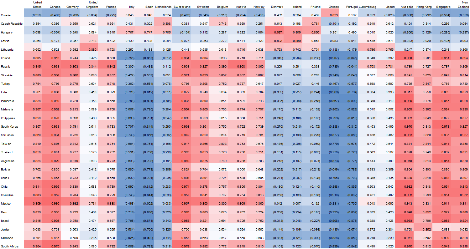
Figure 1.2.1: Correlation Matrix: Regression Coefficient Observing the Relationship in GDP Growth/Contraction between Countries in Emerging Economies v. Countries in Developed Economies; 1970 – Present

009

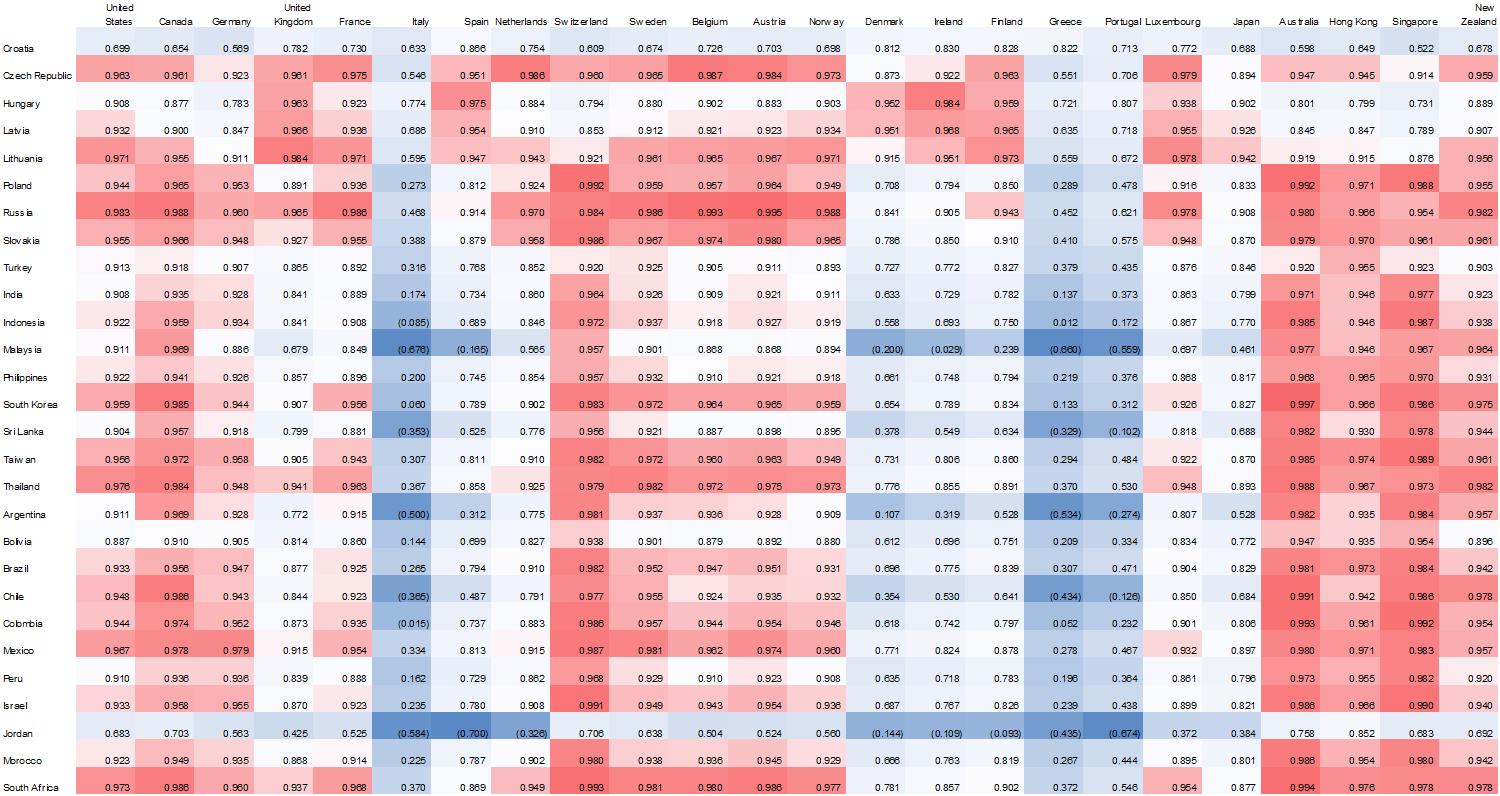
I’m fond of correlation heat maps because they’re a lot easier on the eyes than a standard multivariate regression chart. I formatted my sheet such that high regression coefficients appeared in red, those closer to the median in white, and low levels of correlation in blue. Additionally, I originally assembled my data in such a way that each country was ordered alphabetically, but eventually decided to group countries by region. It proved a wise choice, as we can see above, from a very high level of analysis, that many European regions did not share a statistically significant relationship with those economies in the emerging world; primarily because these countries have fared fairly poorly in the last few decades.

Figure 1.2.2: Isolated Regression Analysis: Relationship between Growth/ Contraction of GDP in Indonesia v. Developed Economies from 1970-Present

010

When I first began to organize my experiment, my primary focus involved isolating countries which grew on trajectories in line with those in the developed world. I am less concerned about generalizations that can be made following my analysis, as I am more interested in observing the “tails” of a given bell curve.

Above represents the regression coefficient of Indonesia versus the developed economy cohort. From a functional standpoint, this graph “zooms” in on the correlation matrix. I put it together primarily to allow myself not to focus when observing countries on an individual basis.

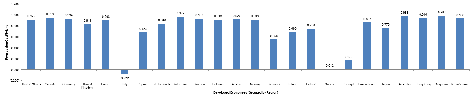
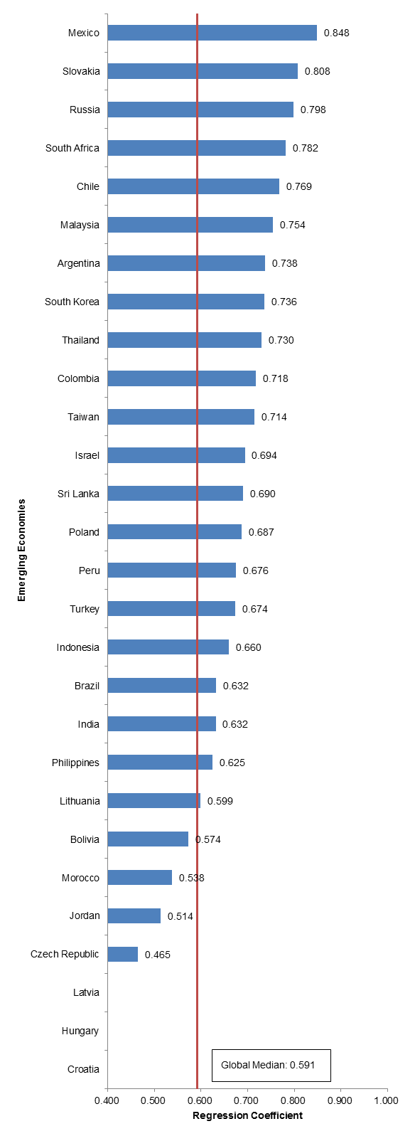
Figure 1.2.3: Analysis of Global Median; Relationship Between Growth/Contraction in GDP in Emerging Economy v. Developed Nation Cohort; 1970-Present

011

Finally, I also assembled a summary chart that illustrates the median correlation in growth between emerging economies and developed economies. With this tool, we are able to observe which countries generally grow (or contract) in/out of line with developed economies. Our global median in our original sample set is very high, primarily because we’re observing a relatively longer period of time. In the next section, I isolate the time period of analysis to reflect what I had deemed appropriate in session 1.1: the period from 2008 to the present day, excluding China and Venezuela.

Part 2

At this point in time, I was interested in observing the period 2008-present for two reasons. The first derives from our session previously, deeming the period one with relatively little noise by which confounding variables interefering with our data set were minimized. Additionally, the period 2008 – the present represents a relatively turbulent time in the financial markets. Following the second most severe recession of the century, the trajectories by which economies recovered from the crisis are interesting to observe, especially considering the peaks in the equities markets we’ve been experiencing in the US.

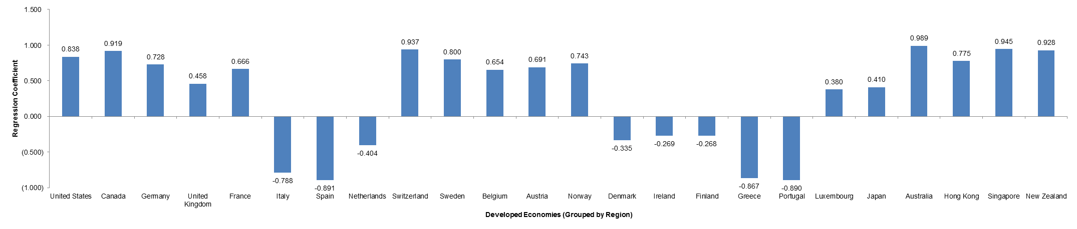
Figure 1.2.4: Correlation Matrix: Regression Coefficient Observing the Relationship in GDP Growth/Contraction between Country in Emerging Economy v. Country in Developed Economy; 2008 – Present

014

Isolating our period of analysis, the most obvious point of observation illustrates that the relevant trends continuing from 1970 – the present are more pronounced when we isolate the time period. It is necessary to note; however, that this statement cannot be held as an overarching generalization – the period is one involving many confounding factors, including the exclusion of certain countries at different periods of times, or inclusion when countries have enough data.

Nonetheless, it is possible to observe above, that countries seemed to grow in line with one another an a regional basis, with Europe involving most of the laggards, representing a negative relationship with most emerging economies. The most fascinating trend I would like to follow up on is the lack of relationship between Asian countries and Eastern European countries (top right quadrant). I will follow up on which industries are relevant in each region, which I will expand on on a later date.

Figure 1.2.5: Isolated Regression Analysis: Relationship between Growth/ Contraction of GDP in Indonesia v. Developed Economies from 2008-Present

012

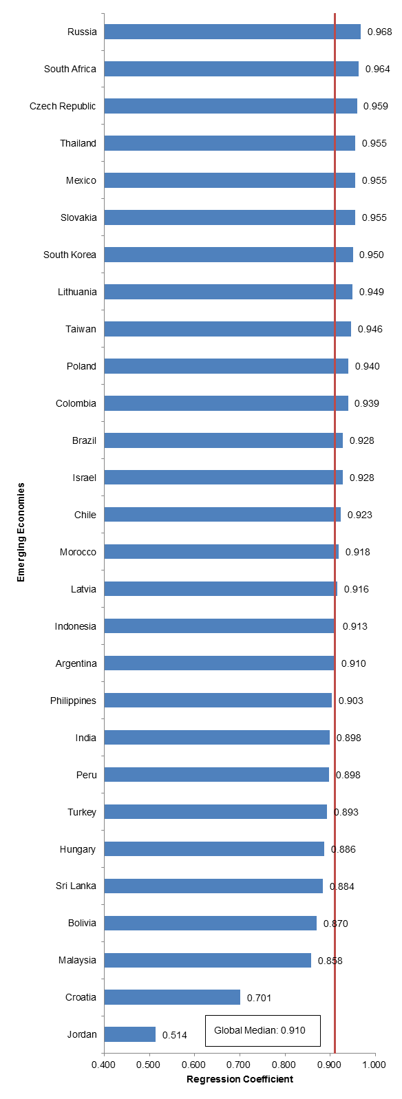
As we can observe in figure 1.2.5, the global median dips significantly when we isolate our point of analysis. This is very exciting, primarily because it represents that emerging economies do not grow and contract in line with developed economies, and that other variables may affect growth, which I will look to further research on a later date.

Figure 1.2.6: Isolated Regression Analysis: Relationship between Growth/ Contraction of GDP in Indonesia v. Developed Economies from 2008-Present

013

Finally, we come to our most isolated point of analysis – this time, from the perspective of Indonesia. Not surprisingly, Italy, Spain, Greece, and Portugal remain the least correlated with the trajectory of India’s growth. With Indonesia, it will also be useful to observe its relationship with Indonesia. It is important to note that Indonesia shares similar growth trajectories to those of Australia and New Zealand. I will follow up on this later.

Follow Up

It is now possible to pinpoint which emerging economies to delve in to in order to understand which sectors/industries are primary drivers of growth in this countries. It is helpful to observe the relationships in growth between emerging economies and developed economies because developed economies can be tertiary and even primary indicators of the prospects of growth within a country. With this data, I plan on assembling the following next:

  • Time series analysis of growth in the emerging economies to further hone in on which countries to analyze
  • Sector ETF breakdown of each emerging economy to understand what indicators to look for when preparing investment theses later down the road
  • Assemble a list of important economic indicators in developed countries. This will be used to observe 1) the immediate price reaction in sector indexes in a developed economy and 2) the subsequent effect on an emerging economy

I am rather excited to begin logging point three, but it is necessary to continue assembling the foundation for my analysis to ensure that I am not missing data moving forward.

Economics – GDP Growth

For the first portion of my analysis, I am interested in determining the correlation between growth in emerging ecnomies vis a vis developing countries.

Figure 1.1.1: % Increase / (Decrease) in Size of Cohort vs. Population Size: Emerging Market Cohort

001

From the onset, I understood that it would not be appropriate to compare countries on a group by group basis. The reasoning for this is because my primary focus of analysis involves emerging nations. This creates a problem because countries are commonly added or subtracted from this cohot for varying reasons (no reported data, countries were too small, countries became too big), so it was necessary to cleanse the data I had on hand. For this experiment, I divided countries by subgroup; dividing them in to 4 cohorts. There is overlap amongst each cohort, but it will be appropriate for analysis later on.

I defined countries as 1) emerging 2) developed 3) g7 4) eu. I wanted to isolate the periods of time by which countries were added or subtracted from each cohort from the time period November 1970 until the present day (or more precisely defined as CQ2 2014). I accessed the information by downloading world GDP by country on a quarterterly basis on Factset.

As we can see in figure 1.1, from the period in the middle of the 1990’s to today, many countries were added to this cohort. I quickly chose to isolate my focus of analysis from mid 2000 onward.

Figure 1.1.2: Mean and Median GDP of Emerging Market Countries

002

At this point in time, it is very obvious that country additions/ subtractions had a tremendous impact on our specified points of analysis. There is a sharp drop in median/average GDP for the emerging markets cohort right before CY 2013.

I dug further, to observe the absolute variance between the countries with the highest GDP and the countries with the lowest GDP:

Figure 1.1.3: Variance in GDP in Emerging Market Nations, Min to Max

003

The disparity was only further exacerbated when we analyzed the cohort on an absolute, rather than normalized basis (observing the avg/median).

Observing the rate of change of average and median GDP on a more isolated basis, it becomes clear that this cohort is unsuitable for our analysis. Recall that our primary objective here is to understand the relationship between growth in developed nations vs. growth in emerging market nations.

Figure 1.1.4: Rate of Change of Average/Median GDP in Emerging Market Nations

004

Upon further analysis, I realized that the skew in my data derived from the removal of China and Venezuela from the categorization of Emergin Market Countries. I set out to “cleanse” my data and omitted the two from my next point of analysis.

Figure 1.1.5: Treatment of Emerging Markets Cohort; Removal of China and Venezuela

Figure 1.1.5a: % Increase / (Decrease) in Size of Cohort vs. Population Size: Emerging Market Cohort

005

Figure 1.1.5b: Mean and Median GDP of Emerging Market Countries

006

Figure 1.1.5c Variance in GDP in Emerging Market Nations, Min to Max

007

Figure 1.1.5d: Rate of Change of Average/Median GDP in Emerging Market Nations

008

Following the removal of China and Venezuela, we achieved a much more suitable cohort of analysis. We cleaned our data by holding constant a few variables, the primary variable being additions/substractions of countries within our data set with the capacity to skew our data distinctly. By isolating the period of time of our analysis, we were able to control for this variable. Additionally, by removing significant outliers within our data set allowed us to “normalize” our population. Most notably, a comparison of figures 1.1.5b and 1.1.5d accurately surmise that our treatment was effective.

Next steps

The purpose of our experiment is to run a regression on the rate of growth/(conraction) of emerging markets vs. developed economies. I’d like to determine by what degree growth in developed nations preceed growth/contractions in emerging nations. From an elementary perspective, this is an obvious correlation. However, by isolating our study, it may be possible to determine/identify various relationships including:

  • The lag between rapid change in growth in a developed nation v. an emerging nation
  • If any countries grow on a trajectory independent of developed nations

The first is relevant because the ability to identify this relationship may present a signficant market opportunity. If it is possible to identify the lag/lead time of an occurence in a developed nation, it may represent a significant signal to add/remove positions from various emerging economies.

Second, identifying countries that grow independent of developed nations represent significant opportunity for long term growth and minimized risk following uncontrollable macroeconomic factors.

Additionally, the purpose of this introductory treatment is to isolate special regions to observe later on. Recall that the next part of this analysis involves parsing out ETFs by country to develop a framework to follow important industries within each country to follow. By understanding these relationships from a macro perspective, it will be possible to gain greater context for how different “levers” in emerging markets may react relative to the broader economy.