Part I
Following our previous session during which we determined the period of time and what cohort was suitable for our analysis, I sought to develop tools I could use to observe the relationships between growth/contraction in emerging economies relative to developed economies with more precision. With the data set I arranged from session 1.1, I began to structure our data such that I could dynamically observe growth relationships on the basis of which cohorts I would like to use and what time period I would like to observe. Like many sessions where I found myself getting too far/obsessive with assembling my sheet in a clean and efficient manner, I was able to scrape together a suitable first suite of tools that will be useful going forward.
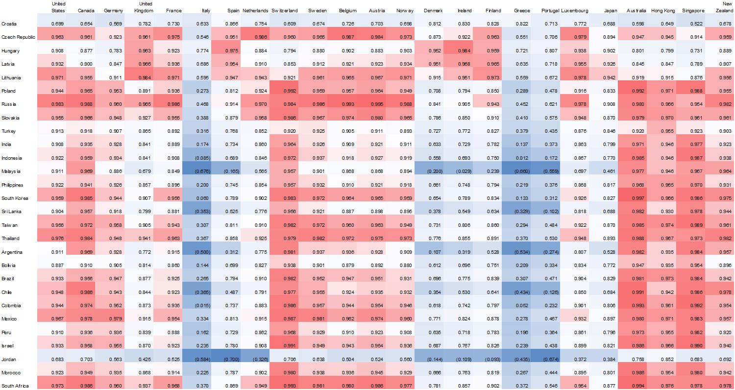
Figure 1.2.1: Correlation Matrix: Regression Coefficient Observing the Relationship in GDP Growth/Contraction between Countries in Emerging Economies v. Countries in Developed Economies; 1970 – Present
I’m fond of correlation heat maps because they’re a lot easier on the eyes than a standard multivariate regression chart. I formatted my sheet such that high regression coefficients appeared in red, those closer to the median in white, and low levels of correlation in blue. Additionally, I originally assembled my data in such a way that each country was ordered alphabetically, but eventually decided to group countries by region. It proved a wise choice, as we can see above, from a very high level of analysis, that many European regions did not share a statistically significant relationship with those economies in the emerging world; primarily because these countries have fared fairly poorly in the last few decades.
Figure 1.2.2: Isolated Regression Analysis: Relationship between Growth/ Contraction of GDP in Indonesia v. Developed Economies from 1970-Present
When I first began to organize my experiment, my primary focus involved isolating countries which grew on trajectories in line with those in the developed world. I am less concerned about generalizations that can be made following my analysis, as I am more interested in observing the “tails” of a given bell curve.
Above represents the regression coefficient of Indonesia versus the developed economy cohort. From a functional standpoint, this graph “zooms” in on the correlation matrix. I put it together primarily to allow myself not to focus when observing countries on an individual basis.
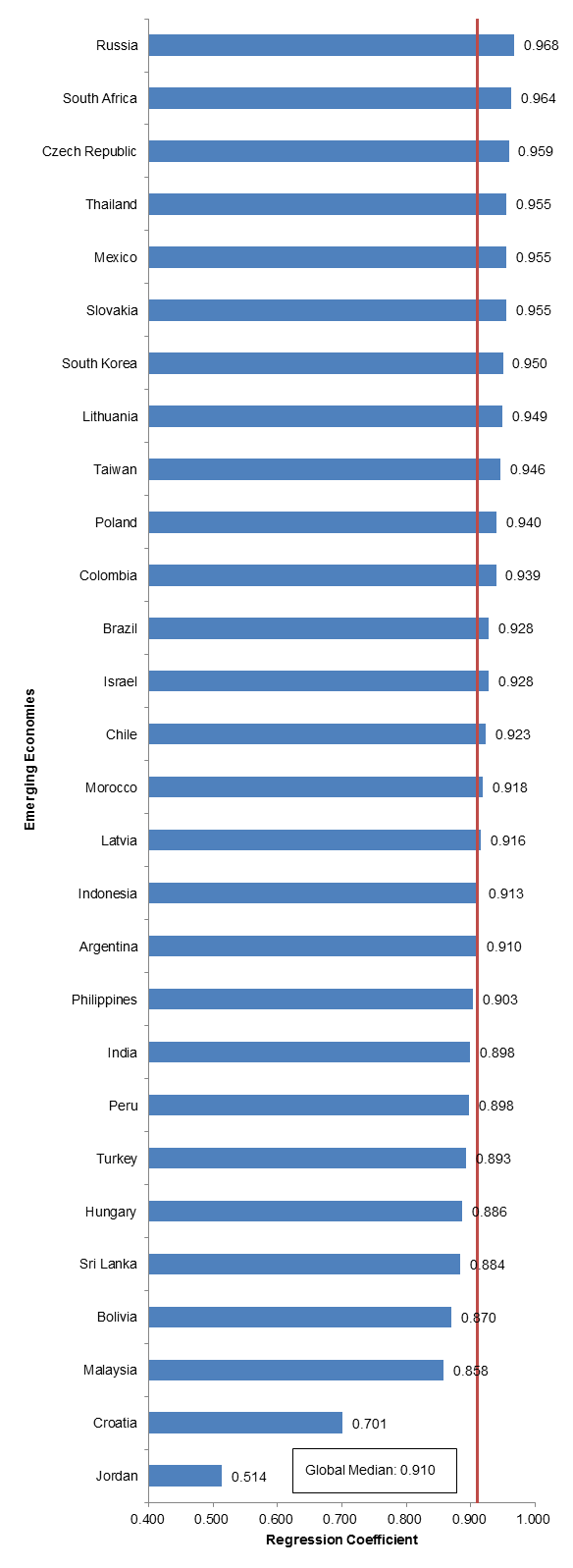
Figure 1.2.3: Analysis of Global Median; Relationship Between Growth/Contraction in GDP in Emerging Economy v. Developed Nation Cohort; 1970-Present
Finally, I also assembled a summary chart that illustrates the median correlation in growth between emerging economies and developed economies. With this tool, we are able to observe which countries generally grow (or contract) in/out of line with developed economies. Our global median in our original sample set is very high, primarily because we’re observing a relatively longer period of time. In the next section, I isolate the time period of analysis to reflect what I had deemed appropriate in session 1.1: the period from 2008 to the present day, excluding China and Venezuela.
Part 2
At this point in time, I was interested in observing the period 2008-present for two reasons. The first derives from our session previously, deeming the period one with relatively little noise by which confounding variables interefering with our data set were minimized. Additionally, the period 2008 – the present represents a relatively turbulent time in the financial markets. Following the second most severe recession of the century, the trajectories by which economies recovered from the crisis are interesting to observe, especially considering the peaks in the equities markets we’ve been experiencing in the US.
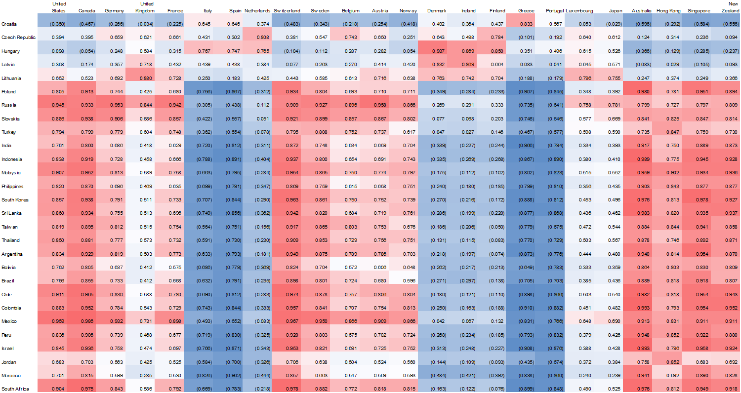
Figure 1.2.4: Correlation Matrix: Regression Coefficient Observing the Relationship in GDP Growth/Contraction between Country in Emerging Economy v. Country in Developed Economy; 2008 – Present
Isolating our period of analysis, the most obvious point of observation illustrates that the relevant trends continuing from 1970 – the present are more pronounced when we isolate the time period. It is necessary to note; however, that this statement cannot be held as an overarching generalization – the period is one involving many confounding factors, including the exclusion of certain countries at different periods of times, or inclusion when countries have enough data.
Nonetheless, it is possible to observe above, that countries seemed to grow in line with one another an a regional basis, with Europe involving most of the laggards, representing a negative relationship with most emerging economies. The most fascinating trend I would like to follow up on is the lack of relationship between Asian countries and Eastern European countries (top right quadrant). I will follow up on which industries are relevant in each region, which I will expand on on a later date.
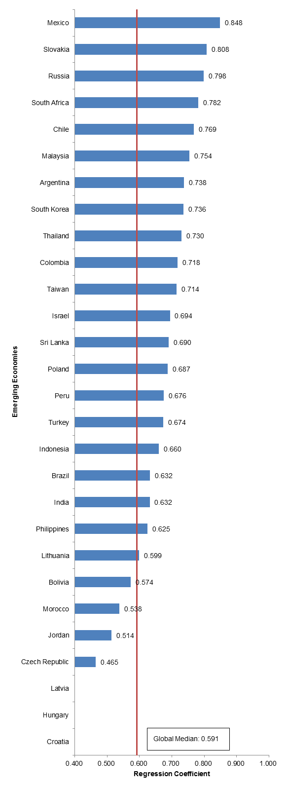
Figure 1.2.5: Isolated Regression Analysis: Relationship between Growth/ Contraction of GDP in Indonesia v. Developed Economies from 2008-Present
As we can observe in figure 1.2.5, the global median dips significantly when we isolate our point of analysis. This is very exciting, primarily because it represents that emerging economies do not grow and contract in line with developed economies, and that other variables may affect growth, which I will look to further research on a later date.
Figure 1.2.6: Isolated Regression Analysis: Relationship between Growth/ Contraction of GDP in Indonesia v. Developed Economies from 2008-Present
Finally, we come to our most isolated point of analysis – this time, from the perspective of Indonesia. Not surprisingly, Italy, Spain, Greece, and Portugal remain the least correlated with the trajectory of India’s growth. With Indonesia, it will also be useful to observe its relationship with Indonesia. It is important to note that Indonesia shares similar growth trajectories to those of Australia and New Zealand. I will follow up on this later.
Follow Up
It is now possible to pinpoint which emerging economies to delve in to in order to understand which sectors/industries are primary drivers of growth in this countries. It is helpful to observe the relationships in growth between emerging economies and developed economies because developed economies can be tertiary and even primary indicators of the prospects of growth within a country. With this data, I plan on assembling the following next:
- Time series analysis of growth in the emerging economies to further hone in on which countries to analyze
- Sector ETF breakdown of each emerging economy to understand what indicators to look for when preparing investment theses later down the road
- Assemble a list of important economic indicators in developed countries. This will be used to observe 1) the immediate price reaction in sector indexes in a developed economy and 2) the subsequent effect on an emerging economy
I am rather excited to begin logging point three, but it is necessary to continue assembling the foundation for my analysis to ensure that I am not missing data moving forward.


